The Magic of Color in Travel Photography: Capturing the Vibrancy of the World
1 March 2026
Let’s be honest — when you’re scrolling through your phone or flipping through a travel magazine, what grabs your attention first? Yep, the colors. That bright blue ocean, the golden-hued temples, the flaming red street food stalls — they speak louder than words. Color in travel photography isn’t just a nice bonus; it’s the heartbeat of the whole experience.
Whether you’re an aspiring travel photographer or just someone who wants to capture the unforgettable vibes of your travels, understanding how to use color can turn your snapshots into storytelling masterpieces. So, buckle up because we’re diving into the world of vibrant skies, bustling markets, and soul-soothing landscapes where color is king.
Why Color Matters in Travel Photography
Think of color as the emotional translator of your travel photos. It’s the thing that makes someone go from “Nice pic” to “Woah, I need to go there!”Colors evoke feelings. A soft pastel sunset can feel romantic and dreamy. A neon-lit alleyway in Tokyo screams adventure and chaos. The colors in your photos can instantly transport someone into that precise moment you experienced — complete with the smells, sounds, and emotions.
Color = Mood
Colors set the stage. Warm colors (reds, oranges, yellows) give off energy, passion, and intensity. Cool tones (blues, greens, purples) feel calm, serene, and thoughtful. By playing with this balance, you can make viewers feel exactly what you felt when you were standing in that spot, camera in hand.Color Tells Cultural Stories
Colors carry cultural significance. Think about the bold turbans in India, the soft whites and blues of the Greek Isles, or the rainbow-colored facades of Colombian villages. These aren't just pretty—they tell stories about tradition, lifestyle, and identity.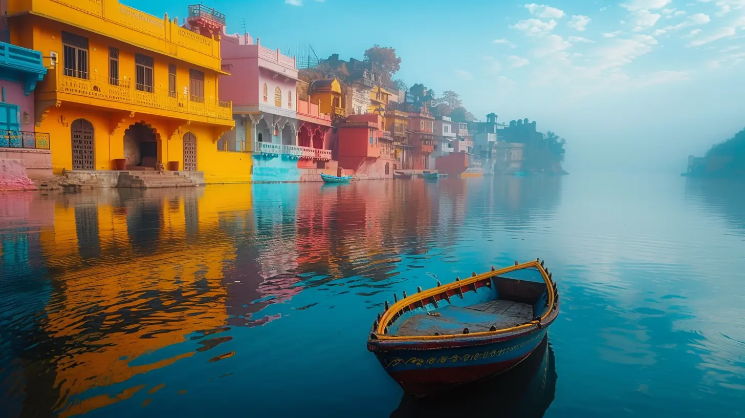
The Psychology of Color: Feel What You See
Understanding the psychology behind colors can give you a major edge in travel photography. Here’s a quick breakdown of what common colors can say in your images:- Red: Energy, danger, passion — think lanterns in Asia or spicy street food.
- Blue: Calm, peace, trust — perfect for ocean shots or wide-open skies.
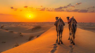
- Yellow: Happiness, sunshine, warmth — ideal for deserts or golden hour landscapes.
- Green: Nature, growth, freshness — works wonders in jungles or mountains.
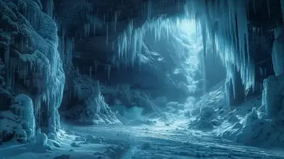
- Purple: Mystery, luxury, spirituality — temples at twilight or lavender fields.
- White: Purity, peace, simplicity — snowy scenes or whitewashed buildings.
Play around with these meanings, and you’ll notice your photos start to evoke stronger emotional responses.
Light and Color: A Match Made in Heaven
Light is the paintbrush, and color is the paint. You can’t talk about one without the other.Golden Hour Is Your Best Friend
You’ve probably heard all the buzz about golden hour — that dreamy period right after sunrise and before sunset. During these times, colors turn soft, warm, and insanely photogenic. Skin tones glow, shadows stretch, and literally everything looks more magical.Midday Light? Not So Friendly
Shooting under a blazing midday sun can wash out colors or create harsh contrasts. But that doesn't mean you should pack it in. Use shadows to your advantage or go for high-contrast shots in desert areas or stark cityscapes.Night Lights = Neon Dreams
Night photography opens up a whole new color palette — think blues, purples, neons, and city lights. Get creative with long exposures and reflections. Street markets at night? Pure eye candy.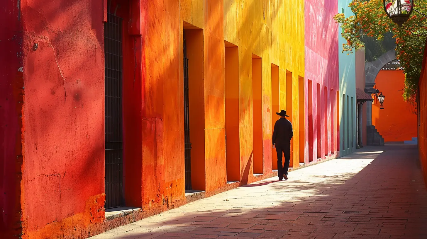
Color Composition Techniques That Make Photos Pop
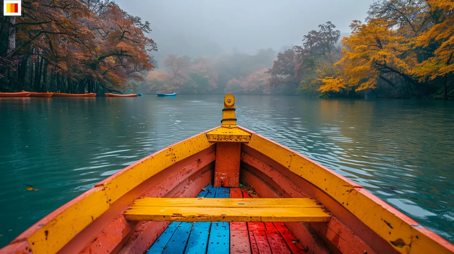
Even if a place is filled with color, your photo won't tell a strong story unless you compose it right. Let’s go over a few easy yet powerful color techniques that can upgrade your travel photography game.1. Use Color Contrast
Pair bold colors together to create tension and drama. Think of a woman in a red dress walking past a turquoise wall — instant visual impact. Complementary colors (like blue and orange, purple and yellow) naturally pop when placed side by side.2. Focus on One Dominant Hue
Sometimes simplicity is more powerful. Frame your shot to highlight one color — like the endless blue of Santorini roofs or the vibrant green of Bali rice terraces. This creates visual unity and makes your photo easy on the eyes.3. Play with Color Blocking
This is basically when chunks of color dominate parts of your photo. You’ve seen it on Instagram — doors, walls, stairs, murals. Color blocking brings structure and serious style to your shot.4. Look for Color Repetition
Spot repeating colors in a frame? Use them to guide the viewer’s eye. Rows of colorful houses, hanging lanterns, or local people in matching outfits — repetition creates rhythm.5. Break the Pattern with a Splash
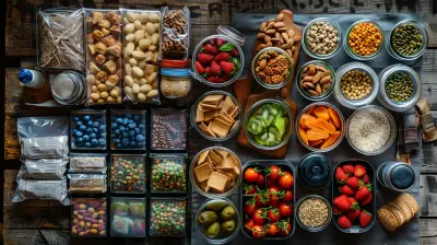
Find a mostly uniform scene and let one unexpected color break the pattern. Imagine a sea of beige sand dunes with one pop of red — boom! You’ve got a standout shot.Where to Find Vibrant Color in the World
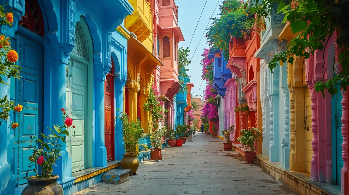
Some destinations just seem to burst at the seams with color. If vivid photography is your jam, here are a few places that should be on your bucket list:India – A Color Explosion
From Holi festivals to everyday street scenes, India is one of the most colorful places on Earth. Bright saris, chaotic spice markets, pink palaces, and orange marigolds — it’s a visual feast.Morocco – Earthy Meets Electric
The warm tones of clay buildings, the deep blue of Chefchaouen, the colorful chaos of Marrakech’s souks — Morocco is an ideal playground for color lovers.Japan – Subtle and Striking
Cherry blossoms in soft pinks, fiery fall leaves, neon-lit cities — Japan balances subtle traditional tones with bold modern ones.Colombia – Rainbow Vibes
In towns like Guatapé and Cartagena, houses are painted like candy boxes. Add in tropical fruits and vibrant locals, and your camera will be working overtime.Greece – White and Blue Perfection
The iconic domes of Santorini, paired with golden sunsets and turquoise waters, create a crisp, clean, and calming palette.
Editing Tips for Enhancing Color (Without Killing It)
Let’s be real — nobody posts straight-out-of-camera shots anymore. But editing shouldn’t mean turning a serene beach into a radioactive blue nightmare. Here’s how to enhance without going overboard:Use Presets, But Customize
Presets are great starting points, but tweak them to suit the photo. Not every pic needs the same vibe. Make small adjustments to contrast, saturation, and warmth.Don’t Overdo the Saturation
Nothing screams “over-edited” like a forest that looks like it just came out of a cartoon. Instead, boost vibrance (it brings out muted colors) and only lightly touch saturation.Balance the Colors
Use split-toning or color grading tools to balance warm and cool tones. Keep skin tones natural, skies believable, and shadows moody — not muddy.Color Trends in Travel Photography
Every year, some colors dominate social feeds and travel brands. Lately, we've seen a love for muted pastels, dusty earth tones, and soft golden filters. But trends come and go. What sticks around? Authenticity.The trick isn’t to chase fads — it’s to find YOUR color style. Are you into bold contrasts? Retro tones? Dreamy desaturation? Stick to what feels right and you'll develop a signature look that stands out.
Gear Tips: Best Tools for Capturing Color
Okay, gear doesn’t make the photographer, but it helps. If you're looking to take your color shots up a notch, consider:A Camera with Good Dynamic Range
This helps you pull out both highlights and shadows without losing saturation. Think mirrorless cameras or DSLRs with solid sensors.Prime Lenses
They’re sharper and often have better light handling, which gives you richer color straight from the lens.Polarizers
These filters reduce glare from water or glass and boost contrast and color saturation — a lifesaver for sunny destinations.Shoot in RAW
JPEGs compress color data. RAW files keep details intact, giving you more control in editing.Final Thoughts: Let Your Colors Tell the Story
Travel photography isn’t just about beautiful places — it’s about how those places made you feel. And color is the magic thread that ties that emotion into every shot. Whether it’s a misty mountain in Iceland or a technicolor market in Bangkok, your choice of color — both in the frame and in the edit — will shape the story you tell.So next time you're out with your camera or just your phone, pay attention to the colors around you. Ask yourself, “What emotion do I want this photo to give?” Then chase that shade, shoot that hue, and let the magic of color do the rest.
all images in this post were generated using AI tools
Category:
Travel PhotographyAuthor:

Pierre McKinney
Discussion
rate this article
2 comments
Sophia Griffin
Beautifully captured! Your words inspire vibrant travel adventures!
April 7, 2026 at 4:06 PM
Jessica Cannon
Color breathes life into travel photography, transforming moments into vivid memories. Each hue tells a story, inviting us to explore diverse cultures and landscapes. Embrace the magic of color; it not only enhances our images but deepens our connection to the world around us.
March 3, 2026 at 3:53 PM
Pierre McKinney
Thank you! I completely agree—color truly elevates travel photography, enriching our experiences and allowing us to connect with the beauty of different cultures and landscapes.